Redesigning a restaurant self-ordering kiosk and table app, and building one design system for both.
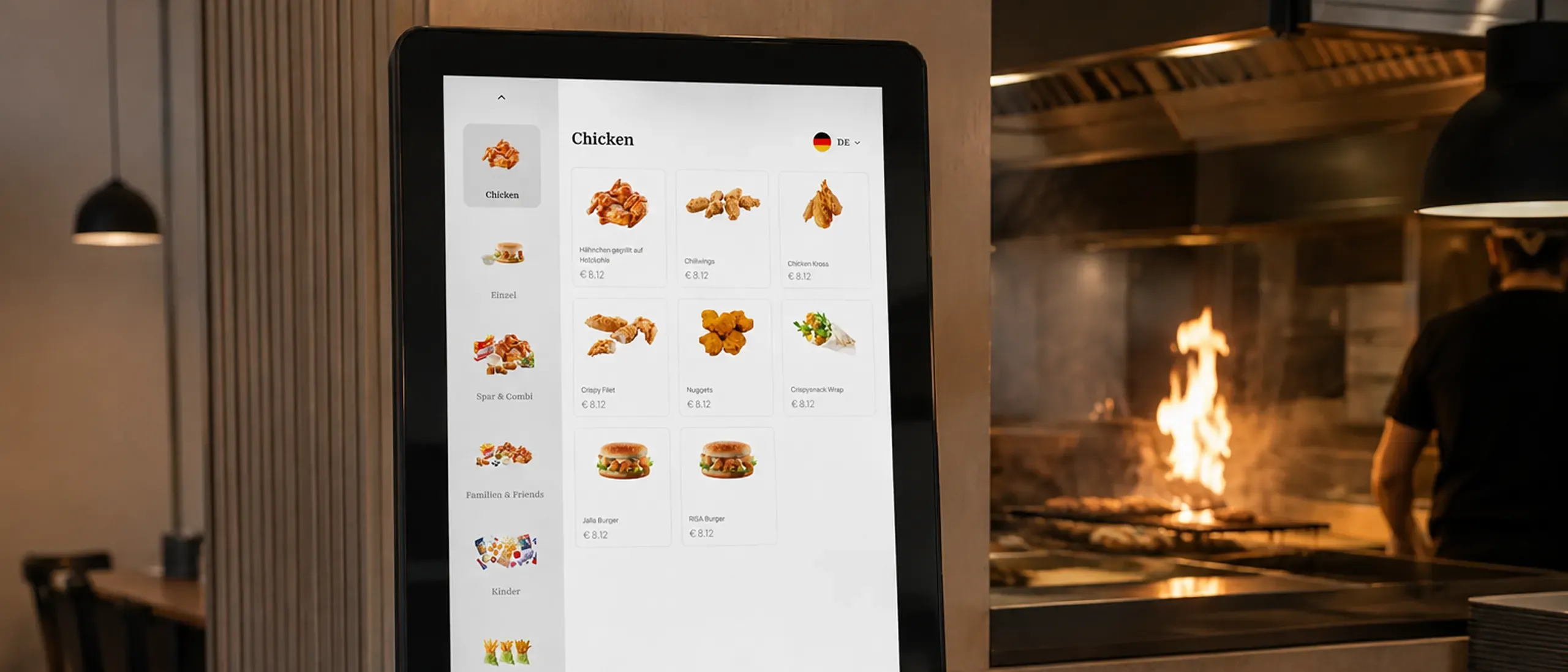
A company selling restaurant ordering software under each restaurant's own brand was losing more than half its kiosk customers. The hardware was installed, but it was not delivering what it promised. Eight months later the same product shipped faster, sold more, and its kiosk and table app ran on one shared design system.
Two products, one backend, three groups who never agree.
Kiosk Ordering runs on touchscreen terminals for self-ordering in busy venues. Table Ordering is a web app guests use to order and pay from the table. Same backend, same menu data, different definitions of success.
Guests
A quick, correct order and a short wait.
Staff
Fewer interruptions and less pressure from the queue.
Managers
Bigger orders, lower cost per order, and a venue that keeps up at its busiest.
Why it mattered
Restaurants, coffee shops and event food courts bought the kiosks for shorter queues, more upsell and staff free for other work. When the kiosks did not deliver that, customers stopped renewing.
Churn on kiosk accounts passed 50%.
Customer success heard the same three things every time. Queues had not moved. Orders came out wrong. Staff were overwhelmed. Managers had bought kiosks to free people up, and had ended up assigning someone to stand beside the screens and help.
3m 30s
Average ordering time
17%
Order error rate
€18.50
Average order value
“We brought in kiosks to speed up service. Instead of freeing staff, they created new bottlenecks. Guests were getting stuck, abandoning orders, or asking for help.”
Restaurant manager
Hospitality suite customer
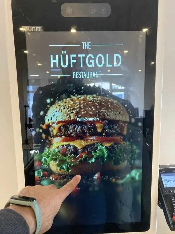
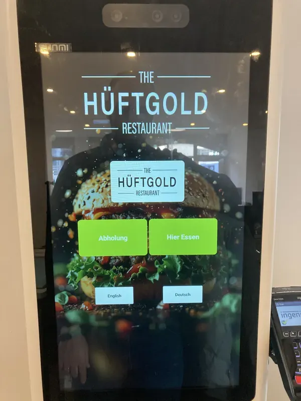
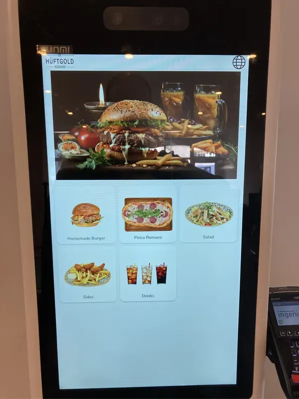
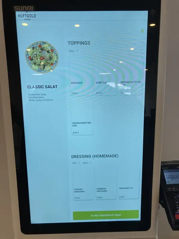
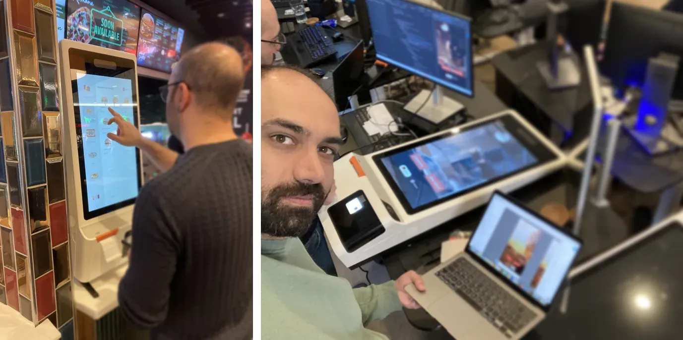
How the kiosk looked before the redesign.
Four screens, photographed on the hardware in a live venue. Nothing staged, nothing re-rendered.
We started on the floor, not in the file.
“The MVP was built by engineers, following directions from customers. Many usability flaws were uncovered in our initial product audit.”
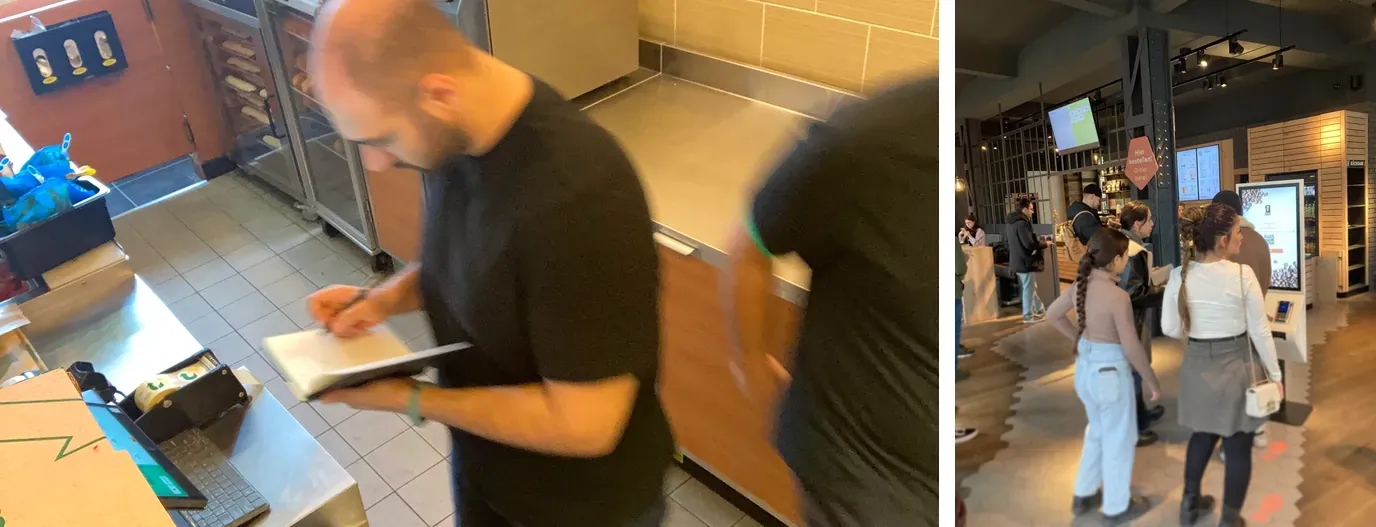
Shifts, not interviews
We took shifts in the venues, taking notes between rushes, watching where guests hesitated, seeing the counter the way staff actually experience it. Then we traced every support complaint back to the exact screen that caused it.
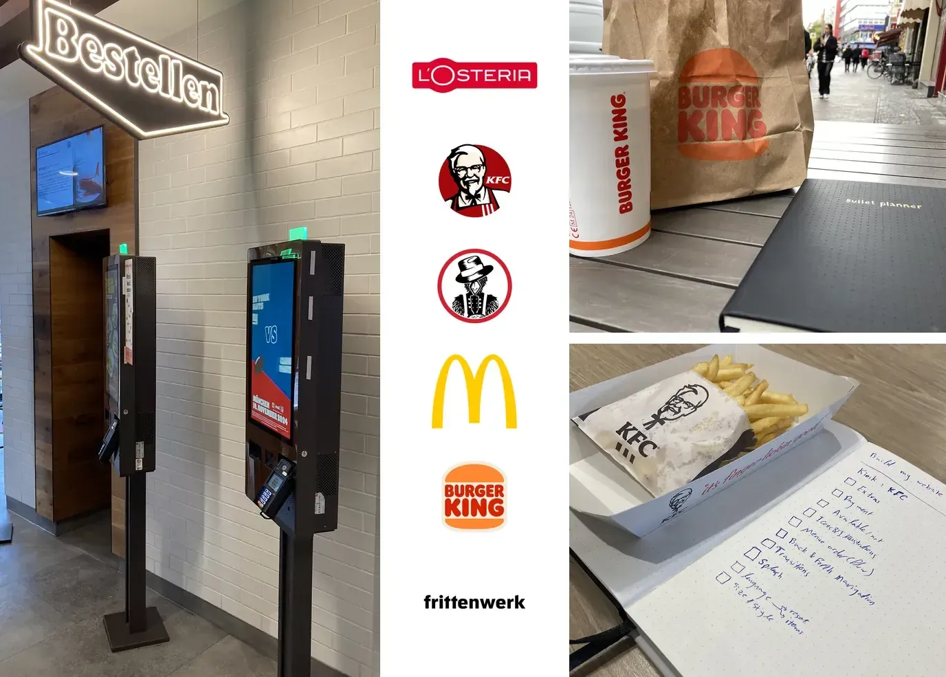
Seven chains, screen by screen
We benchmarked seven chains from McDonald's and Burger King to Slim Chickens, comparing the same six moments in each flow. The point was not inspiration. It was establishing what a guest already expects a kiosk to do before they touch this one.
A blueprint, then a journey map
A service blueprint put what guests see, what staff do and what happens in the kitchen on one page. The guest journey map followed a visit end to end: arrival, kiosk, menu, customization, review, payment, wait, meal, exit.
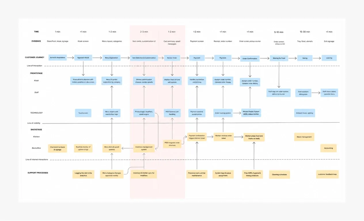
The friction was not spread across the journey. It sat in two adjacent steps.
Item customization and order review. Everything downstream was a symptom. This was not a screen that needed tidying. It was a leaky bucket: guests entered the flow and fell out of it under social pressure, with a queue behind them.
Three design solutions.
Remove the rules guests cannot see
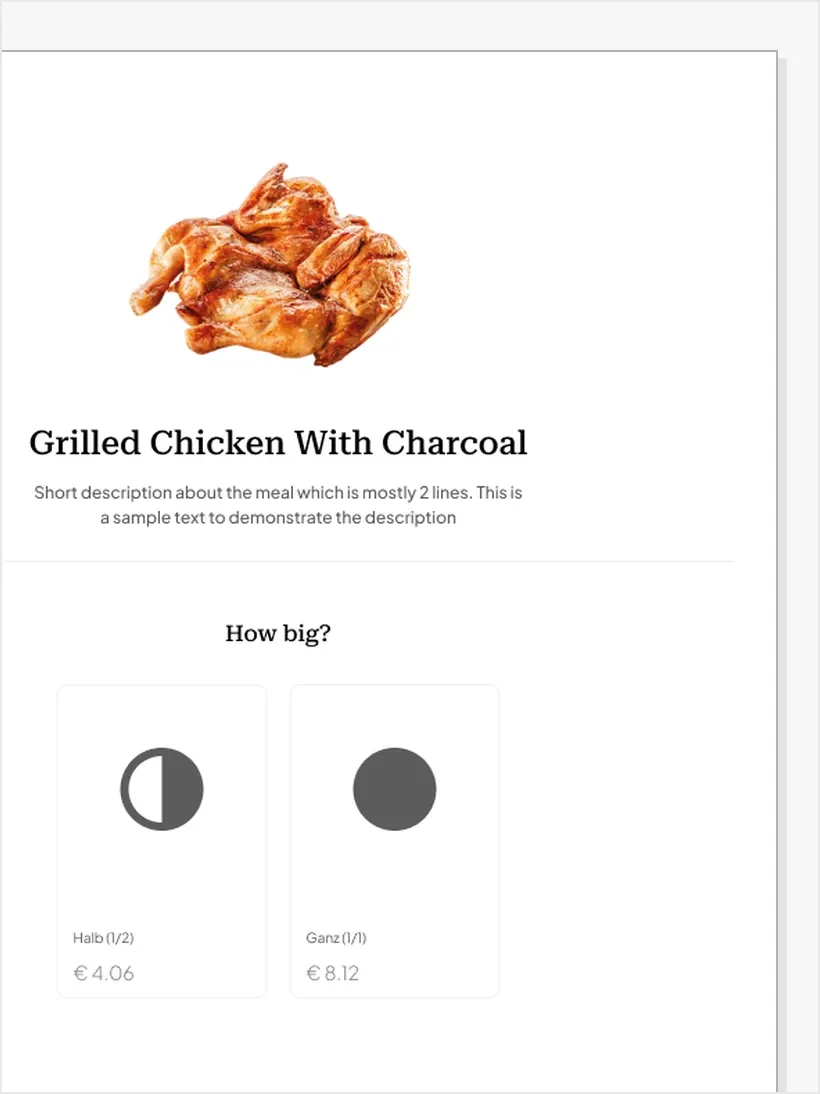
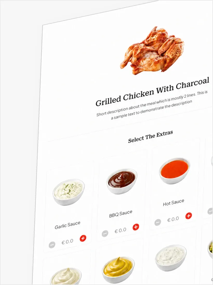
Guests can no longer pick too many or too few options. Each choice only offers answers that work, so nobody makes a mistake and nobody has to be told they made one. Help appears while guests choose, not after something goes wrong.
Separate customization from upsell
The two had been competing for attention in one long scroll. We split them into distinct steps with a fixed hierarchy: the item and its size first, extras after. Upsells stopped being noise inside a decision and became a decision of their own, placed where guests had already committed to the item.
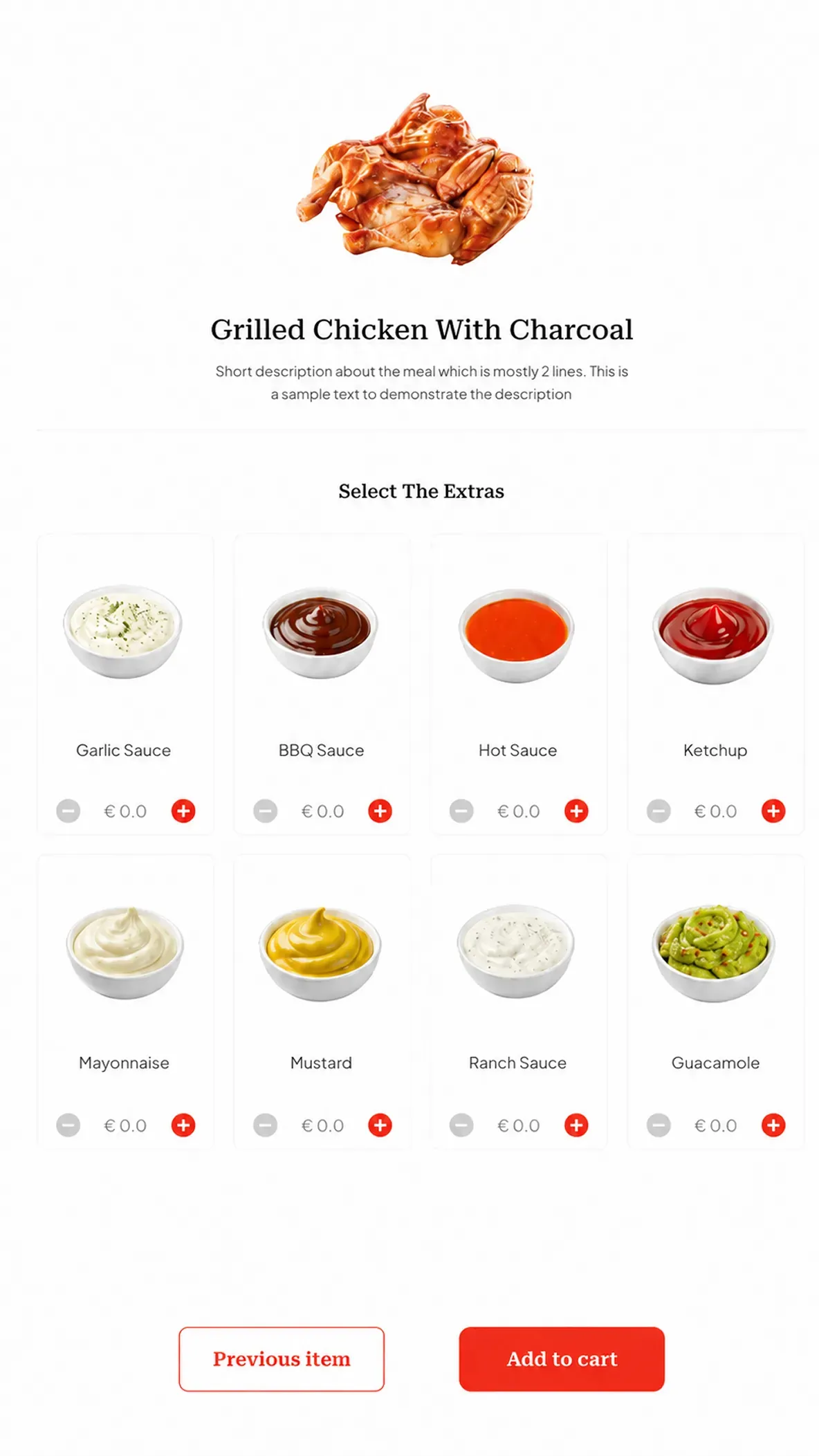
Test where the pressure is
We tested realistic, clickable prototypes with people first. Then fourteen participants in live restaurants: six guests, four staff, four managers, on four tasks. Place a standard order, customize an item, accept an upsell, review before paying.
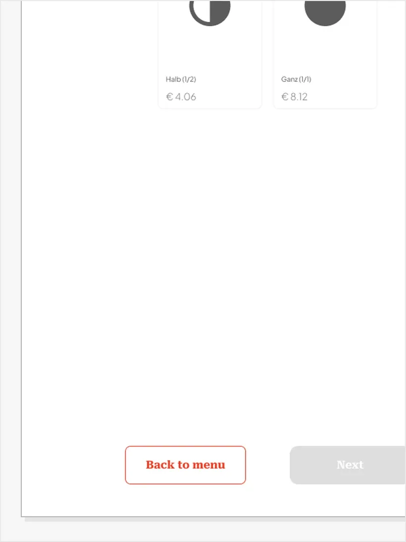
Eight of fourteen guests struggled when the screen moved on to the next step by itself. Five still missed upsells, focused on finishing the main item. Seven read “Back to menu” as a reset button, assumed it would empty the basket, and never pressed it.
The kiosk flow worked. Then guests started complaining about the table.
Kiosk ran on Android, Table on React. Table Ordering still carried a legacy interface with no design file behind it. Every pattern had been solved twice, differently.
Two products, one company, nothing shared but a backend.
Step-by-step customization on one, a long scroll on the other. A clear return path on one, forced re-selection on the other.
For a guest who used both, the second product taught them nothing the first had. For the team, every new feature was designed and built twice.
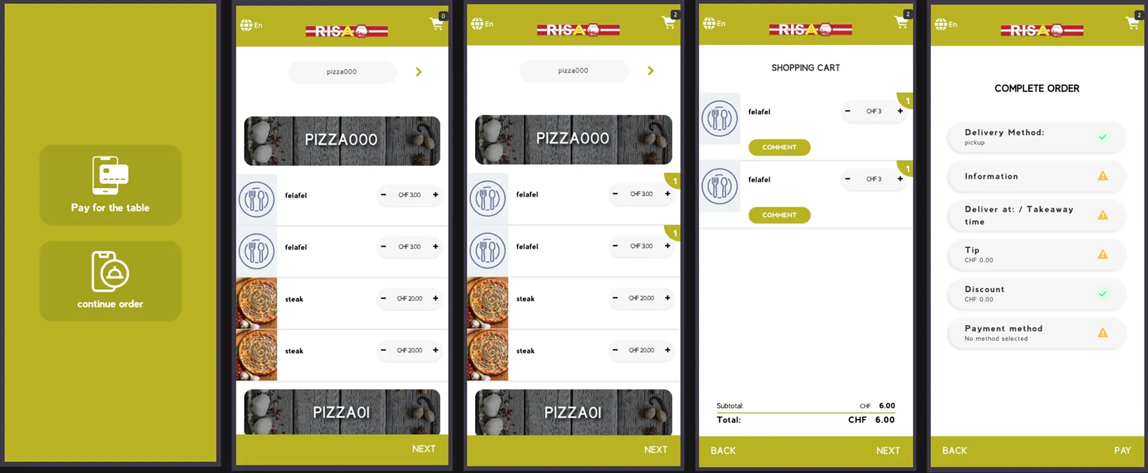
We compared the two products step by step, from the first screen to the end of the order, and ranked every difference by how much it hurt the guest.
On the table app, customizing an item meant one long scroll, and changing the order meant choosing everything again. Guests made selection mistakes and asked staff for help.
Rebuild both steps the way the kiosk already worked: one choice at a time, and an easy way back to edit.
We built one design system for both products.
The two products already shared a backend. On screen, nothing was shared. We built one set of building blocks, designed once, then assembled two ways: for the kiosk and for the table.
The brand, set up once for both products.
The client's colours, the themes built from them, and the typefaces. Every colour, type size and spacing value is defined once, so a change in one place reaches both products.
Coral Red
- HEX
- FF3400
- RGB
- 255, 52, 0
Pure White
- HEX
- FFFFFF
- RGB
- 255, 255, 255
Gray
- HEX
- F1F1F1
- RGB
- 241, 241, 241
Pure Black
- HEX
- 000000
- RGB
- 0, 0, 0
Blue
Two typefaces, each with one job.
Roboto Serif names the food and the screens. Inter carries everything a guest reads to decide: descriptions, prices, buttons.
Grilled Chicken
Classic pizza with fresh tomatoes. €12.99
Add to cart
The shapes the product repeats.
Six shapes recur across both products. Each does one job, so a guest learns it once.
Same components, two sizes.
Each component is built once, then sized for a screen you stand at and a screen you hold.
Category tabs
The selected tab carries the brand colour.
Quantity stepper
Large enough to tap at a kiosk, compact on a phone.
Buttons
Main action, a way back, and a step that is not ready yet.
How each screen adapts from kiosk to phone.
Both products use the same parts. Where a kiosk and a phone need a different layout, written rules decide how the screen changes.
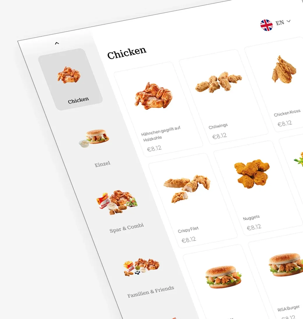
Menu navigation
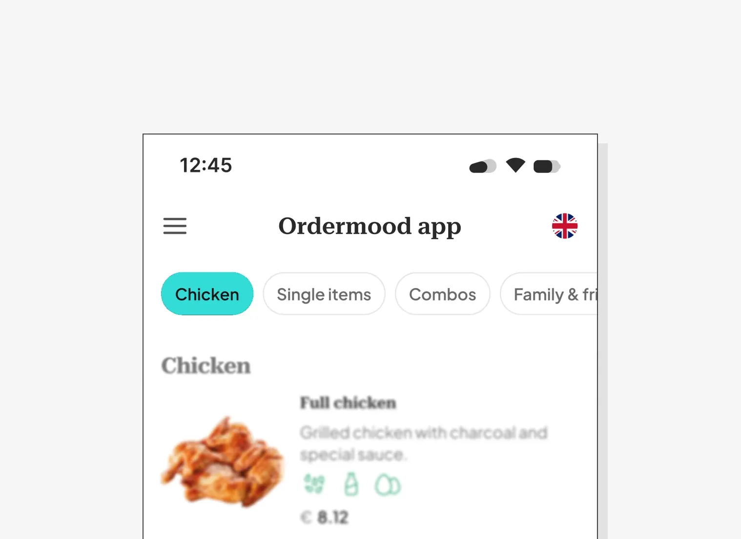
Side menu on the kiosk becomes a top menu on mobile.
Customization
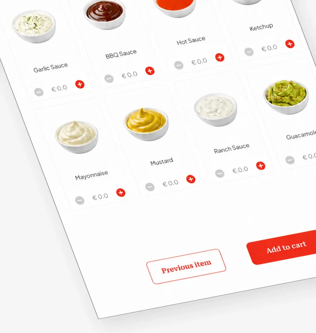
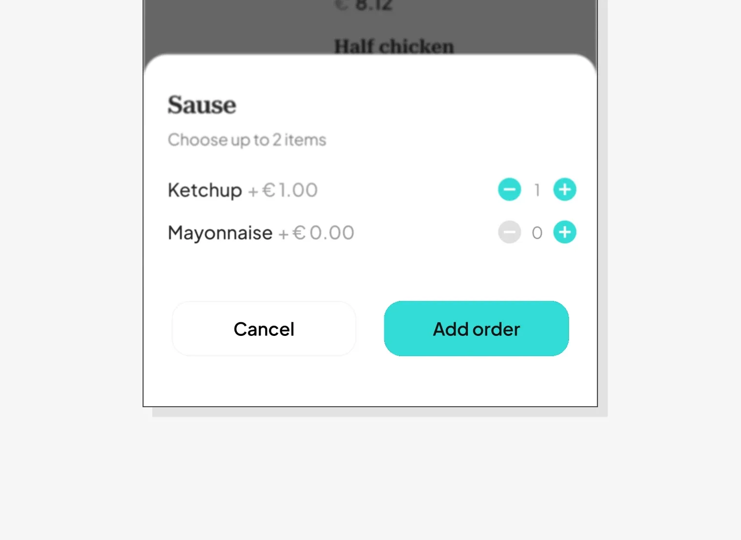
On the kiosk, choices take over the full screen. On a phone, they slide up from the bottom.
Flows that stay different
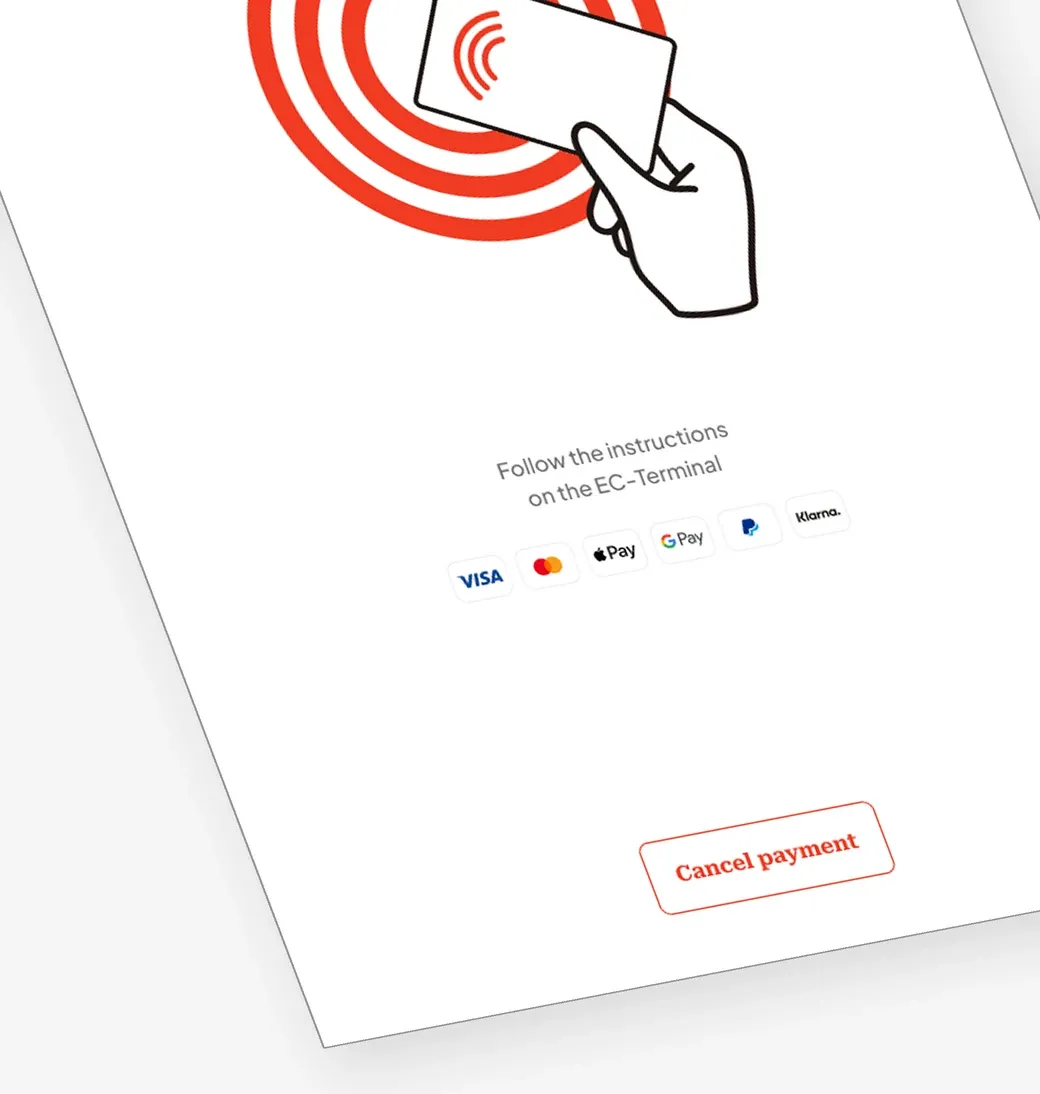
At the table, guests can pay item by item. At the kiosk, one payment covers the whole order.
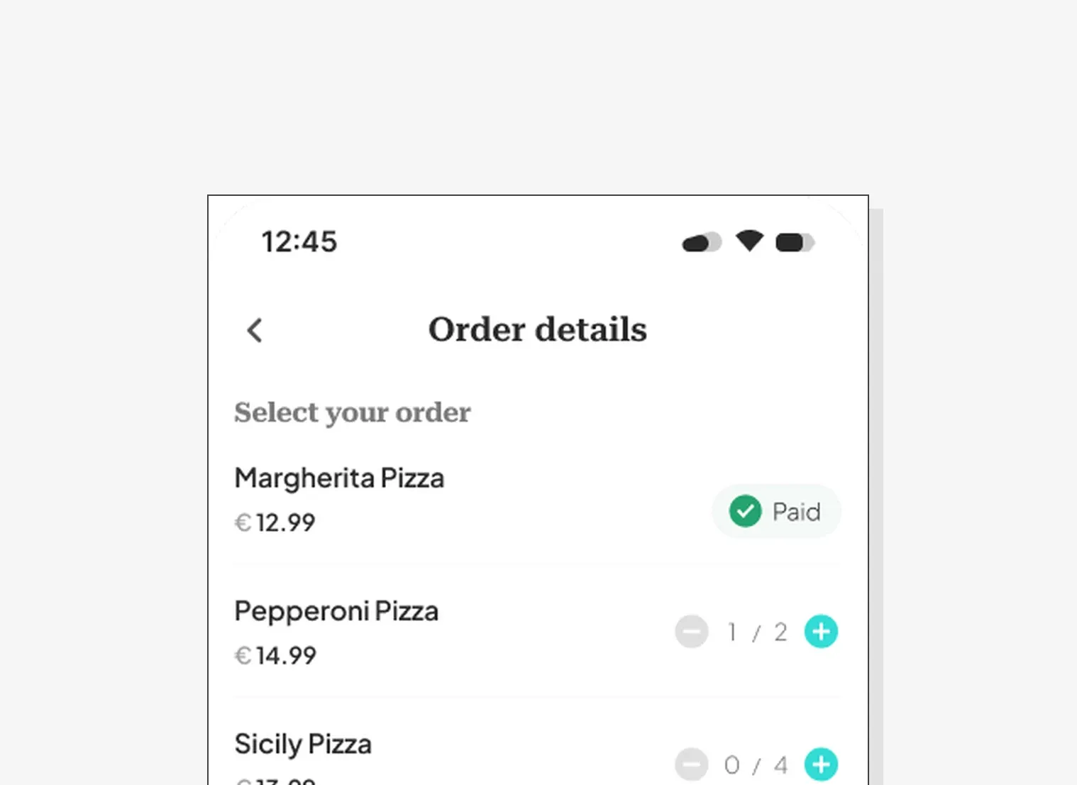
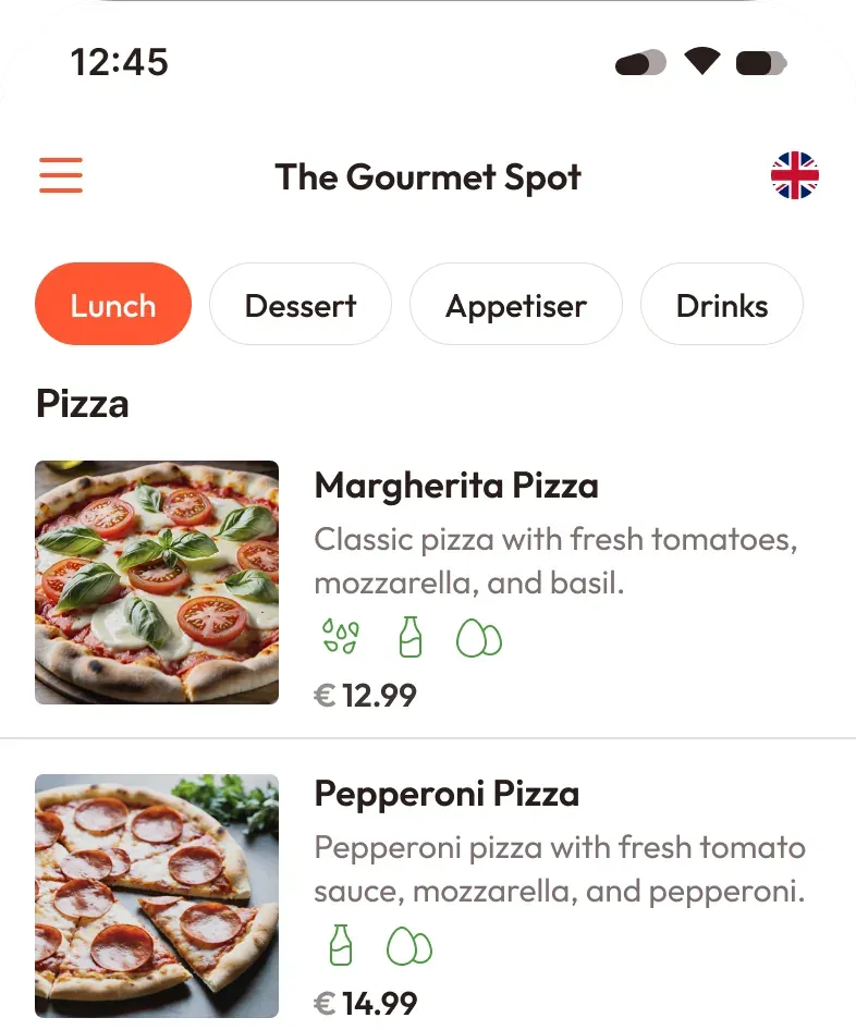
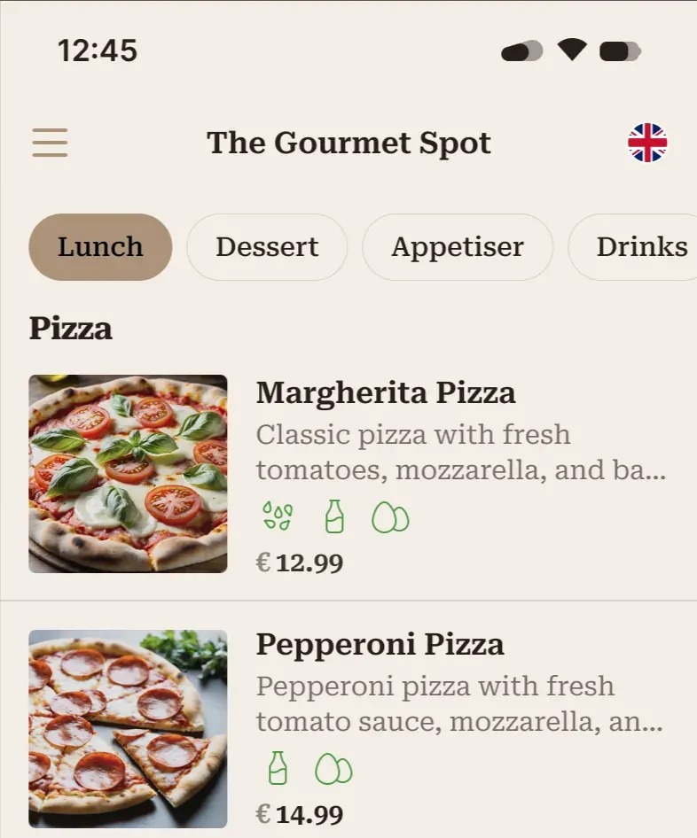
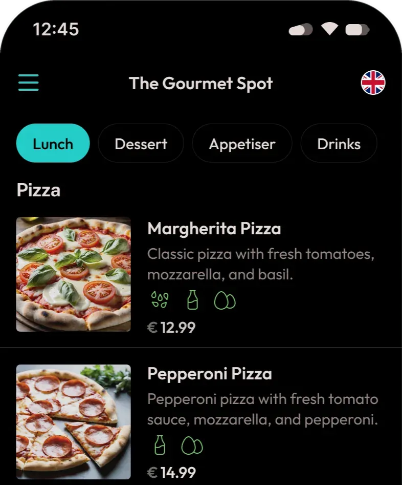
One product, any restaurant's brand.
Brand colours are set in one place, not on every screen. Change them and the whole product takes on another restaurant's brand without a redesign. That is what let the client sell one product to many restaurants.
Results and impact
Before and after, against the targets agreed with the client before design started.
| Before | Target | After | |
|---|---|---|---|
| Average ordering time | 3m 30s | –50% | 2m 06s |
| Order error rate, kiosk | 17% | <10% | <9% |
| Average order value | €18.50 | +25% | +20% |
11%
Order errors for guests who use both the kiosk and the table, down from 16%
7 weeks
Time to design and ship each release, down from 10 weeks
One system
One design system behind both products, on Android and on the web
Ready to raise?
Let's talk about your Series A timeline and what's holding back your investor conversations.