From a powerful research tool to a platform clinicians and researchers can both move through.
Proof of Our Impact
A usable, stable product
Higher engagement, and with it, customer trust.
A process the team owns
Every request has a clear home, path, and owner.
A modular design system
Reusable patterns keep the product consistent as it grows.
From feature to workflow
Hossein
Lucid Genomics
"Our product was organized around features; our users worked in flows. They proved that with real research instead of opinion, and rebuilt the structure around it. It changed what we built, not only how it looked."
Lucid Genomics is a Berlin healthtech company building an AI-driven platform for DNA analysis. A spin-off from the Max Planck Institute for Molecular Genetics and the Charité – Universitätsmedizin Berlin, the platform helps healthcare and pharmaceutical teams extract genomic information — including the "dark genome" — to improve diagnostics, cancer screening, and drug discovery.
The founding team pairs deep science with commercial drive: Uirá Souto Melo (CEO, scientific background), Hossein Moeinzadeh (CTO, computer science), and Achim Geppert (COO, sales and business). With €1.3M in pre-seed funding — led by Caesar Ventures, with B.I.F. Partners, another.vc, and the MPF Accelerator Program — the mandate was to expand the platform and sharpen the AI models behind biomarker identification.
The product worked. The science was sound. The problem was structural.
The challenge
Lucid had a working platform, but users couldn't reliably find or use the features that mattered to them. The architecture was complex, and that complexity had a cost: onboarding stalled, new customers lost momentum, and some existing ones drifted away.
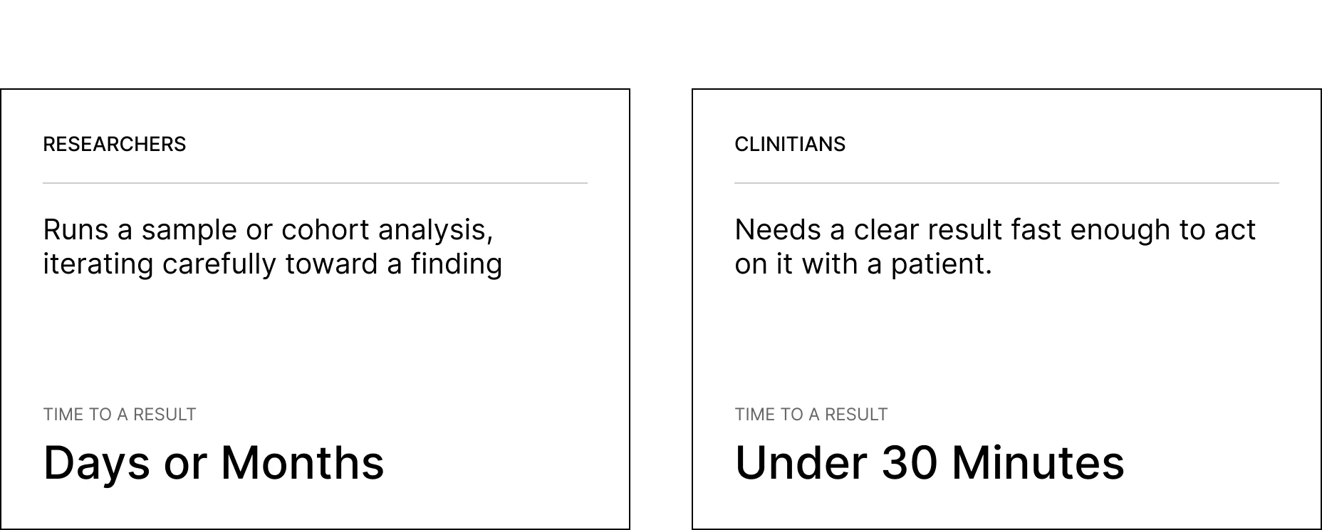
The root of it was audience. The product had been built for researchers, and it didn't scale to clinicians — a fundamentally different user with a different job and a different clock. And it wasn't ready for the next round of funding. Two pressures at once: adoption today, fundability tomorrow.
The symptoms read like a UI problem. The cause ran deeper.
The insight
We started with discovery, not design.
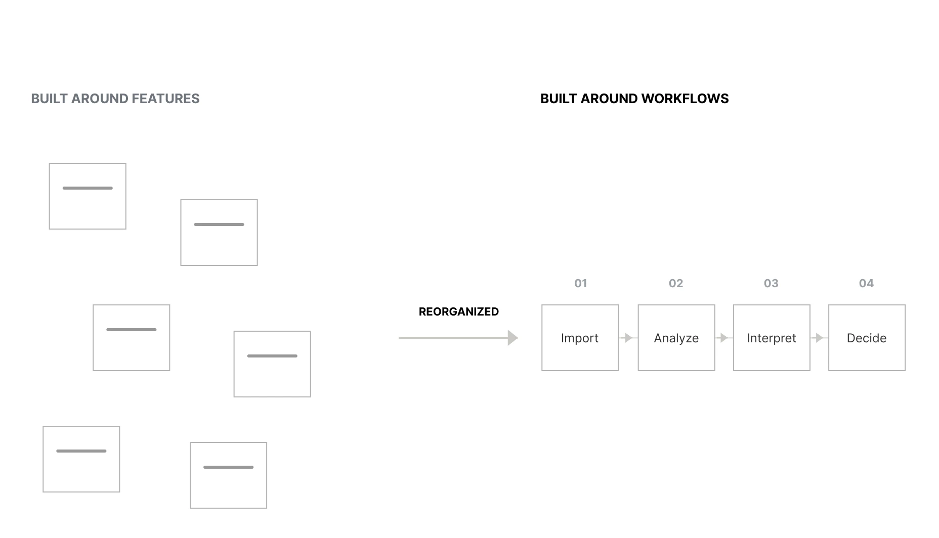
Mapping how users moved through the product surfaced the core problem:the product was organized around features, but users thought in workflows.A researcher running a cohort analysis and a clinician reaching a diagnosis both move through a sequence of steps toward a decision. A feature-based structure forced them to translate their own process into the product's logic at every turn. That translation cost was the friction bleeding adoption.
Everything downstream followed from this: we weren't going to redesign screens. We were going to re-architect the product around how its users actually work — so it could serve researchers and clinicians alike, and hold up under investor scrutiny.
How we worked
We embedded inside Lucid's team for six months. This wasn't design delivered at arm's length — we worked directly with the CEO, CPO, COO, tech lead, customer success, and product owners, alongside Lucid's internal domain experts on both the researcher and clinician sides.

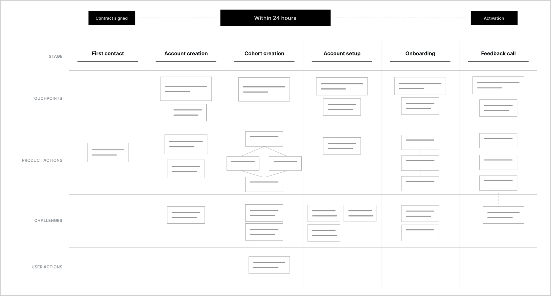
1. Mapped the customer journey
In a workshop, we mapped the journey users travel — from onboarding through active use of the product. This gave every later decision a real step in the user's process to anchor to.
2. Translated features into workflows
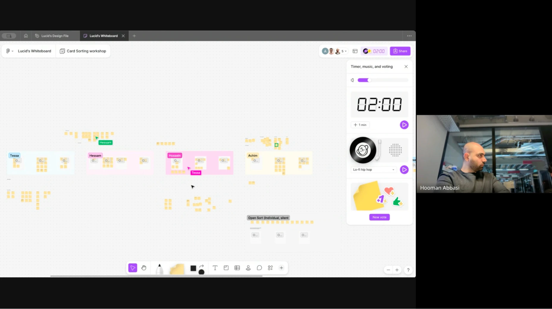
We ran a card-sorting workshop with the people who knew the product and the customers best: the CPO, COO, customer success manager, a product owner, and the tech lead. Together we translated a feature-based structure into a workflow-based one, grounded in each user type's mental model — the researcher who works in days and months, the clinician who needs an answer in minutes.
3. Defined the information architecture
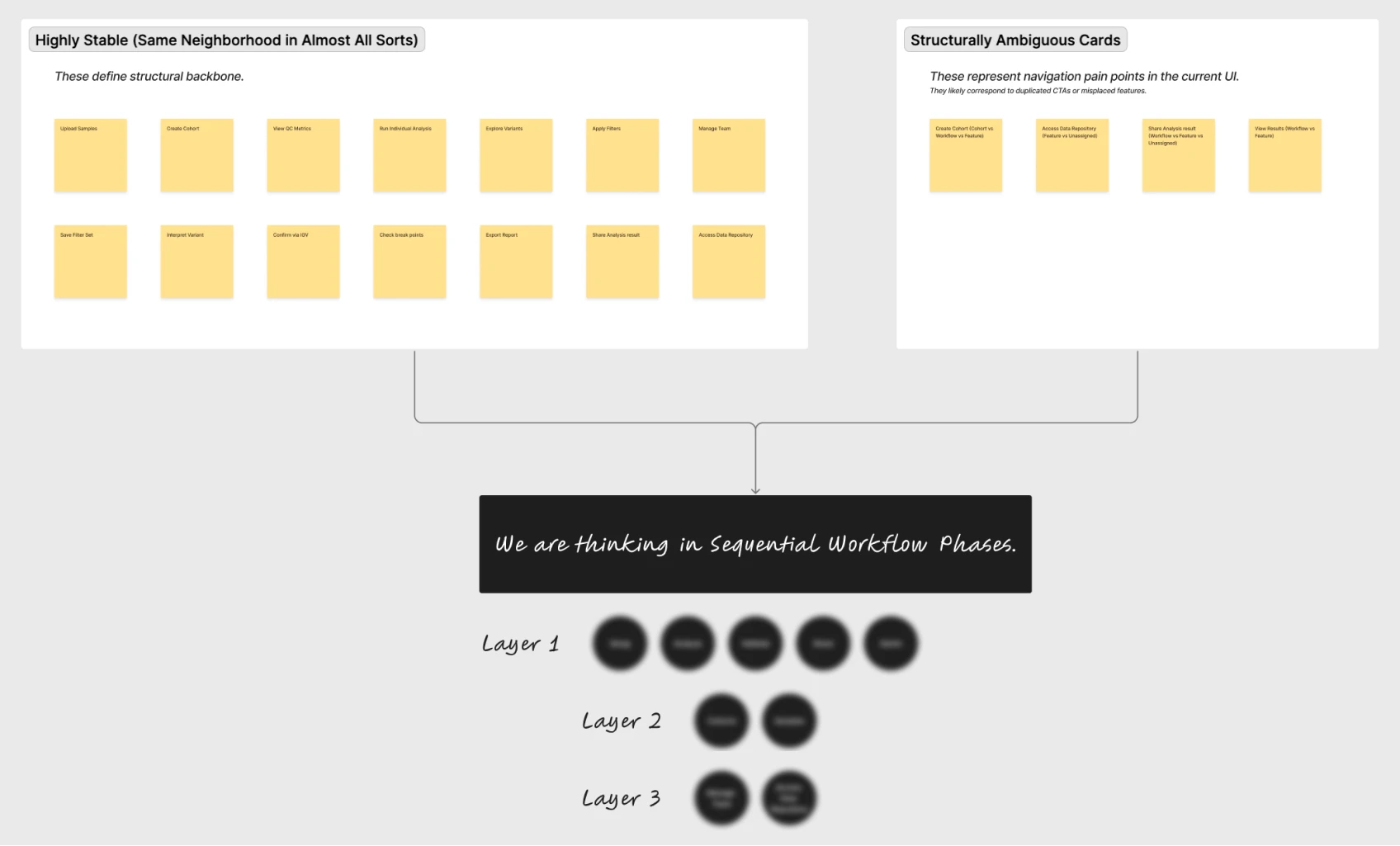
The card sort gave us direction; from it, we defined the product's new information architecture — the structural backbone for everything that followed.
4. Validated with real users
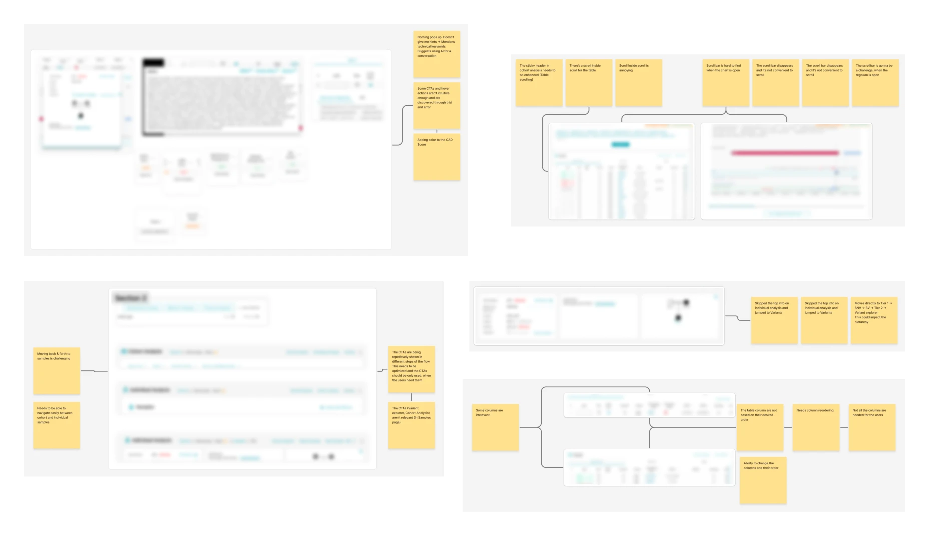
We tested the new structure against reality. We ran usability tests and interviews with eight users and customers, evaluating the assumptions behind the new architecture. Then we analyzed each session individually — capturing screenshots from the product and annotating them directly with the feedback from each session, turning scattered observations into a precise, visual record of what was and wasn't working.

5. Turned findings into a roadmap
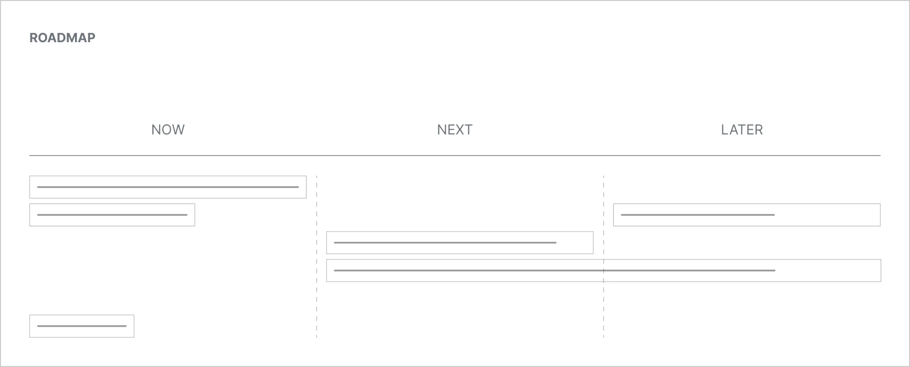
We translated the validated issues into roughly 40–50 user stories, and worked with the CPO to shape them into a product roadmap for the improvements ahead.
Delivery — two milestones
Milestone 1 — Fast, visible wins for a live demo
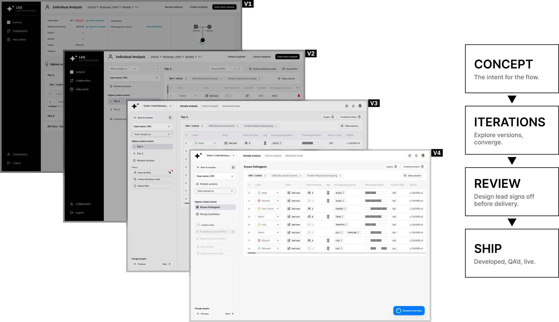
Lucid was attending an industry event and demoing the product. We had a window to ship. Using the usability tests and interviews, we identified the quick changes and key improvements that would matter most on the main feature of the product. We designed them in the first month — delivered the designs in roughly a week — and the team developed them over the following two weeks, with our QA on top.
The point of milestone one wasn't only the fixes. It was proof. A fast, high-quality delivery built the trust that made the next five months possible.
Milestone 2 — Building a stable, usable product over five months
With trust established, we worked month to month with the CPO, defining each month's deliverables together — usability testing, research, product design, and QA. The goal shifted from quick fixes to a durable one: a stable product, genuinely usable, that would grow user engagement and, through it, customer trust.
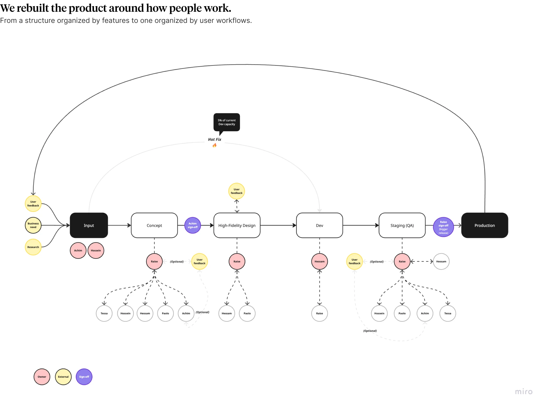
Along the way we noticed a deeper gap: there was no clear product development process. So, with the COO and CPO, we built one — defining where inputs come from, where ideation happens, and who owns each stage. Because the team didn't yet have product-management capacity, we took that ownership: writing user stories, prioritizing, managing stakeholders, defining scope, coordinating the team, and making sure launches shipped on time, QA'd, and at a high bar.
The design system — modularity, not decoration
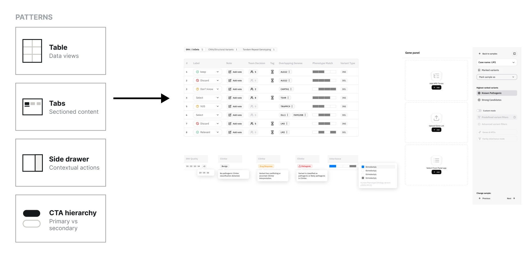
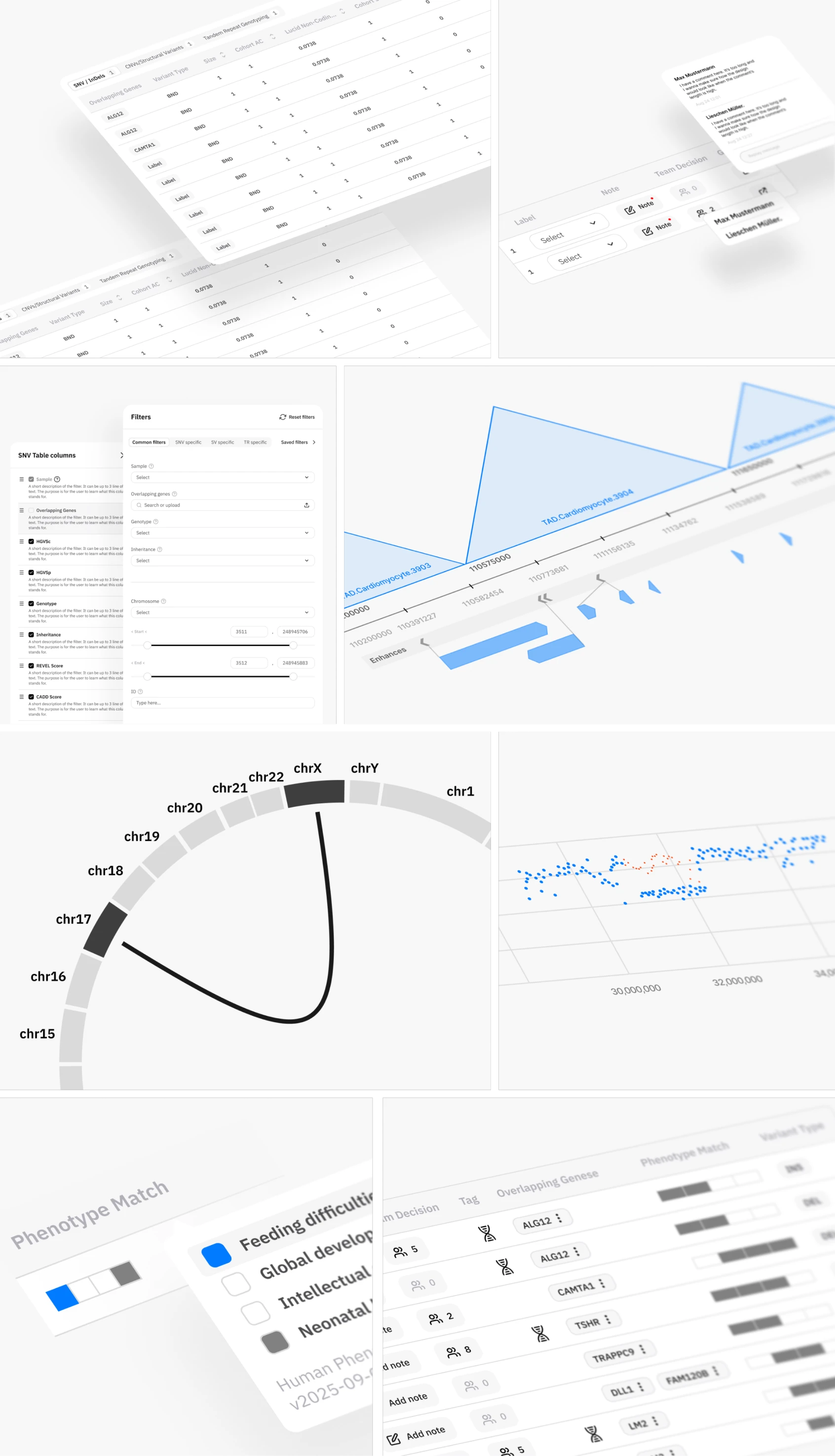
The UI was rebuilt on a design system — but the value wasn't the surface, it was the structure. We built modular components, templates, and organisms designed to be reused across the product for consistency. Once we'd defined the pattern for a table, tabs, a table-and-tabs combination, where CTAs sit, how multiple CTAs behave together, when an action belongs in a side drawer versus a full-screen page, and where users find help — every future screen inherited those decisions instead of relitigating them.
That's what a design system is for: not aesthetics, infrastructure. It's why the team could keep building consistently without us in the room.

Outcomes
By the end of six months, Lucid had a product built around how its users actually work — and a team equipped to keep improving it.

Results and Impact
A usable, stable product
Higher engagement, and with it, customer trust.
A process the team owns
Every request has a clear home, path, and owner.
A modular design system
Reusable patterns keep the product consistent as it grows.